
CSS: The 'ch' unit

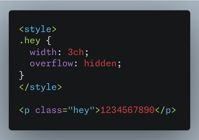
<style>
.hey {
  width: 3ch;
  overflow: hidden;
}
</style>

<p class="hey">1234567890</p>
Dear reader,
Have you heard of or better yet used the ‘ch’ unit in CSS? No? Well, aren't you a lucky one, blissfully unaware of this hidden corner of the CSS universe. But if you have, congratulations on being part of a secret society that actually knows what they're doing.
Behold, the 'ch' unit in CSS – the ninja of web design. Like a shadow in the night, it sneakily sizes your content, making sure each character is as snug as a bug in a rug. Watch this p tag play hide and seek with its letters
"ch" in action
What is the 'ch' Unit?
Yes, it's as mysterious as it sounds. I'll be your less-than-enthusiastic guide through this adventure.
Let's break it down. In CSS 'ch' is a unit of width measurement. The 'ch' unit in CSS is a relatively obscure but clever little thing. It's used to size elements based on the width of the "0" (zero) character of the font being used. Think of it as a tailor who's obsessed with the width of a single character and uses that to measure everything else.
So, when you use 'ch' as a unit, you're telling your website, "Hey, size this piece of text based on how wide the '0' character is in this particular font." It's like using a very specific ruler. This can be handy when you want to align text or create text boxes that fit a certain number of characters, especially for monospaced fonts where every character has the same width.
Using the 'ch' unit, you can specify the width of that container in terms of the number of characters it should hold. It's like saying, "I want this box to be exactly 20 characters wide.”
Why Should You Care?
Now, you might be thinking, "Why bother with this 'ch' nonsense?" Well, dear reader, in the realm of monospaced fonts where each letter is a carbon copy of the next in terms of width, 'ch' has an opportunity to shine. It keeps the width tight, with no unexpected overflows.
Keep it in your mind somewhere, it might be useful when you problem solving a UI problem.
The Origin Story: When Did 'ch' Enter the Scene?
Believe it or not, the 'ch' unit isn't a new kid on the block. It's been around since CSS3 (2013~), hanging out and waiting for its moment to shine. Introduced as part of the CSS Values and Units Module, 'ch' made its quiet debut alongside other relative units, offering a fresh way to size elements based on character width. Other quirky measurements includes the likes of ex which is used to get the height of the letter “x”.
Downsides/Drawbacks of the 'ch' Unit:
Now, let's not get lost in a fantasy where 'ch' is the perfect hero. It has its kryptonite, and that's non-monospaced fonts. When you use 'ch' with these fonts, expect some drama. Why? Because in the world of non-monospaced fonts, characters vary in width, so 'ch' can slice off letters like a clumsy chef. Not pretty.
In this example, by daring to use a non-monospaced font and writing in capital letters, 'ch' reveals its Achilles' heel.
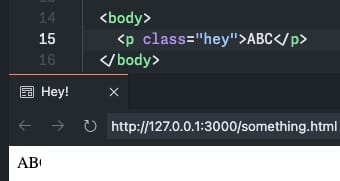
Oh, and a word to the wise: if you're using 'ch' in a p tag, do yourself a favor and set 'overflow' to 'hidden'. Unless, of course, you enjoy the chaotic spectacle of your text spilling out like it's trying to escape your styling.
Conclusion:
So there you have it, a journey through time with the 'ch' unit. It’s more than just a speck in the CSS universe; it's a testament to the evolution of web design. Embrace it, experiment with it, and who knows, you might just start a new trend. Or, at the very least, you’ll have something cool to talk about.
P.S:
Honestly, I had absolutely no intention of writing an article about this. It's all because Bluesky couldn't handle a simple gif or video. So, here I am, pouring my heart out in words because technology decided to be a pain. Hope you find it enlightening, or at least mildly amusing. If not, well, blame it on the lack of multimedia support.